ℹ️ Some details were altered for confidentiality.
About
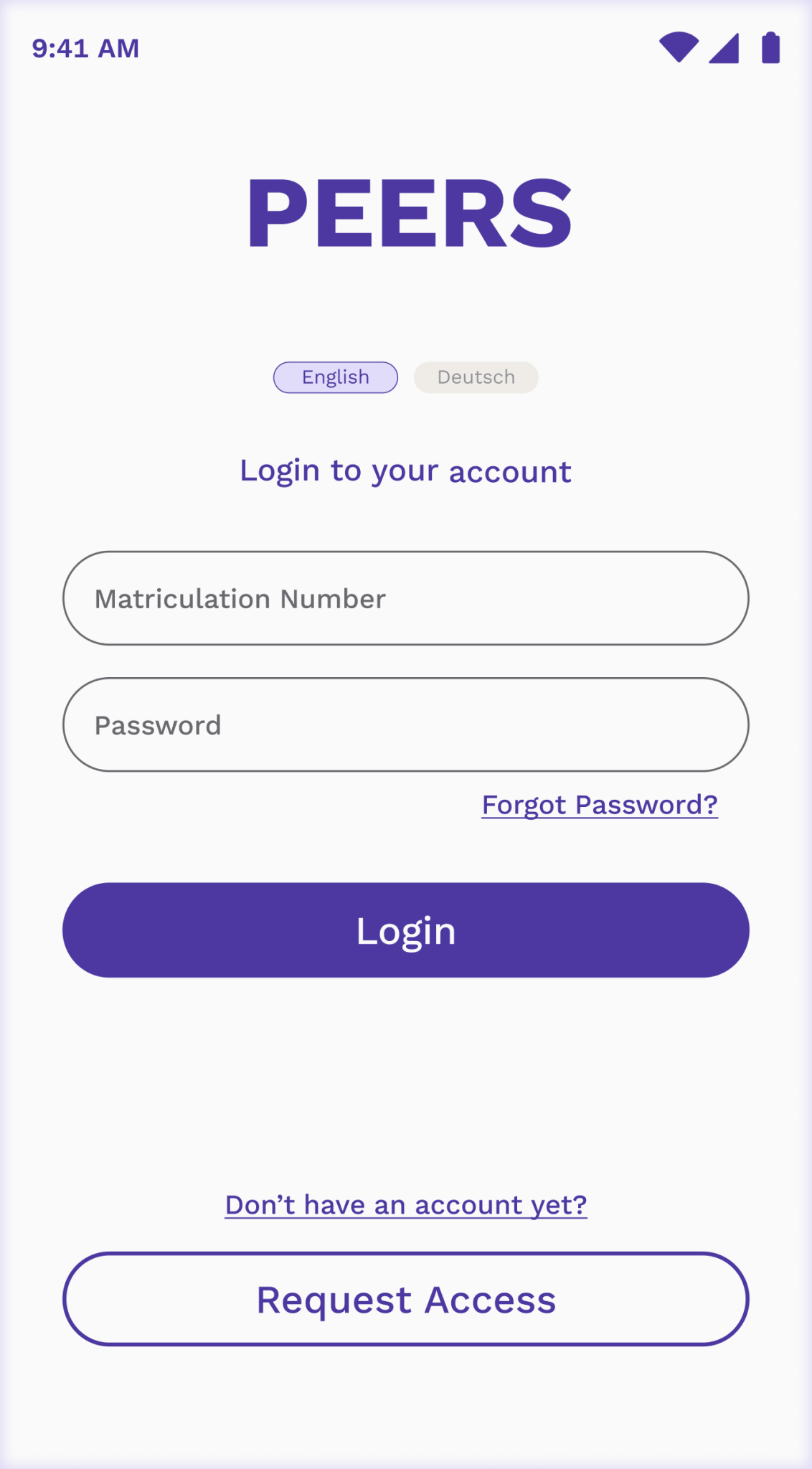
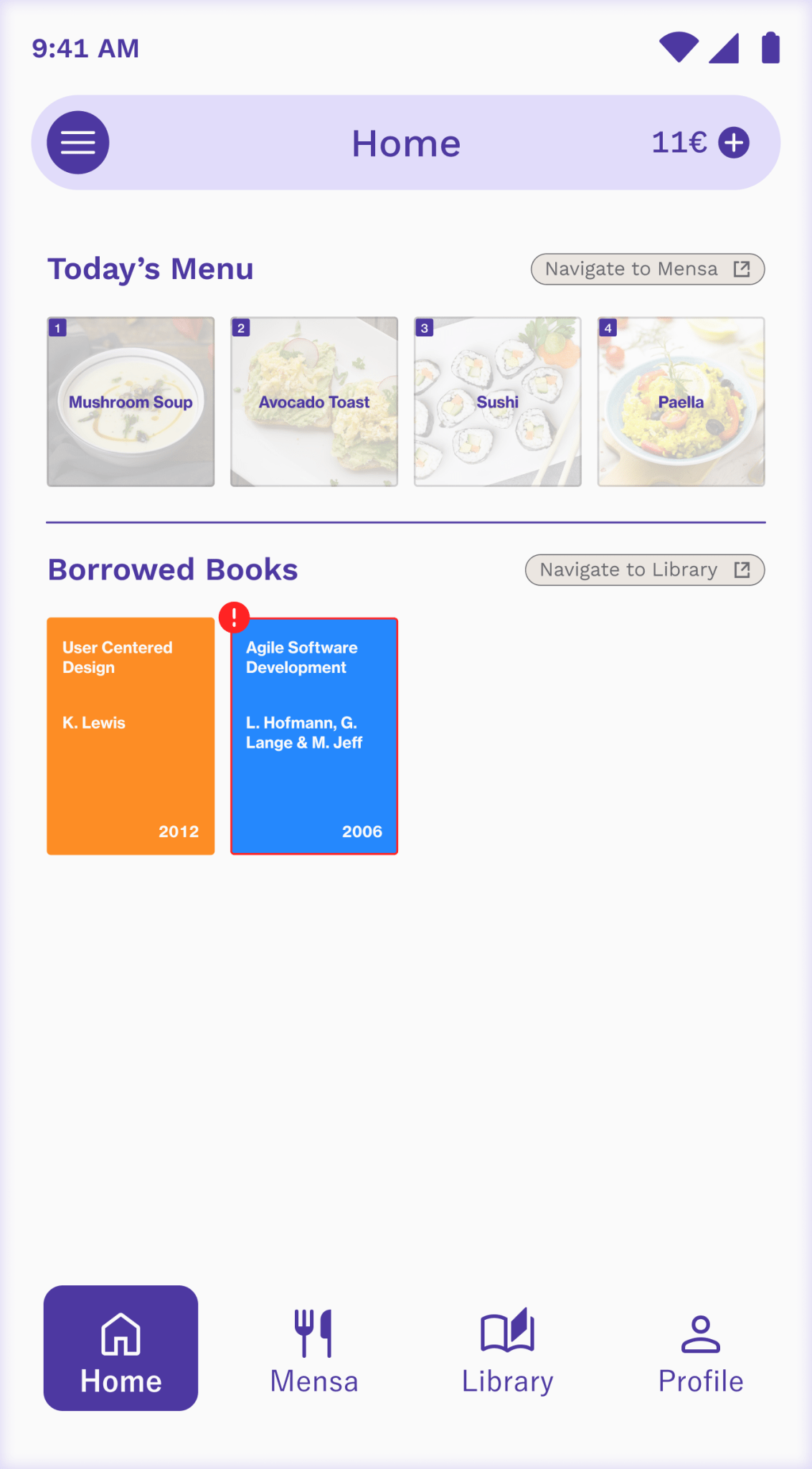
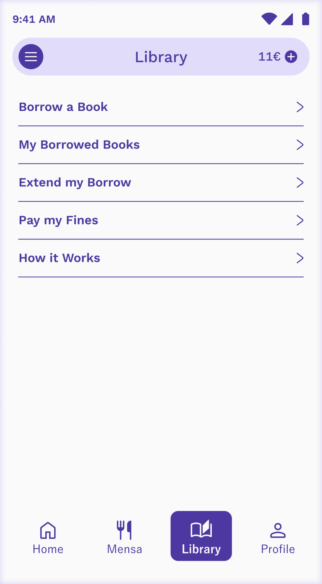
Peers is a smartphone application developed to consolidate the functions of four university cards—Semester Ticket, Mensa Card, Library Card, and Printing Card—into a single digital platform.
Client
This project was part of the university's initiative to digitalize its services, aiming to extend and replace the functionalities of existing physical cards.
Task
Over approximately six months, the project encompassed all stages from conception to delivery, including design and insights.
Team
As part of a three-person team, I was responsible for design and documentation.
Target Group
The project focused on university students (~7,000) across two campuses, though staff and faculty also used some of these cards.
Challenges
The main challenges identified before the start of the project included:
-
Cultural preference for cash: According to a 2018 Deutsche Bank report, "Cash is by far the most popular payment method, at least at physical and virtual points-of-sale".
-
High initial setup cost: Implementing new hardware and software required significant upfront investment.
-
Existing system inertia: The current physical card system was functional and considered "good enough" by management.
User Research
Two methods were employed to gather student needs and requirements:
-
Questionnaire: Initially posted online but received limited responses. It was then distributed via printed copies at the two Campuses, leading to over 200 responses.
-
Interviews: Follow-up semi-structured interviews with 10 students were conducted, averaging 25 minutes each.
Findings
It was revealed that most students often do not carry wallets but always have their phones, using them for most tasks, including payments. The concept of a unified digital card was almost unanimously supported, as carrying four separate cards was considered cumbersome.
Students highlighted the main issues they faced with each of the cards:
-
Semester Ticket: Lacked photo identification, leading to potential misuse like identity theft. It was also easily damaged, being paper-based, and wasted resources as a new ticket was issued every semester.
-
Mensa Card: Lacked photo identification, leading to potential misuse like identity theft. It was also easily damaged, being paper-based, and wasted resources as a new ticket was issued every semester.
-
Printing Card: Had a confusing point system. It also could not be deactivated, and funds were irretrievable if lost or after leaving the university.
-
Library Card: Most students did not know where to obtain this card or why it was separate from the printing card.
Technical Research
Many German universities already utilize a single student ID card that integrates similar functionalities. For instance, the TUM student card acts as a student ID and supports Mensa, library, public transport, and more. The card is updated each semester via a machine that overwrites information, reducing waste.
The costs involved in creating Peers would mostly go towards labor, with minimal hardware expenses, as existing university technology was leveraged. The university had servers for its websites and services. Machines at the Mensa and library already had scanning and NFC capabilities. Maintenance and running costs were expected to be managed by the university’s IT department.
Low-Fidelity Prototype
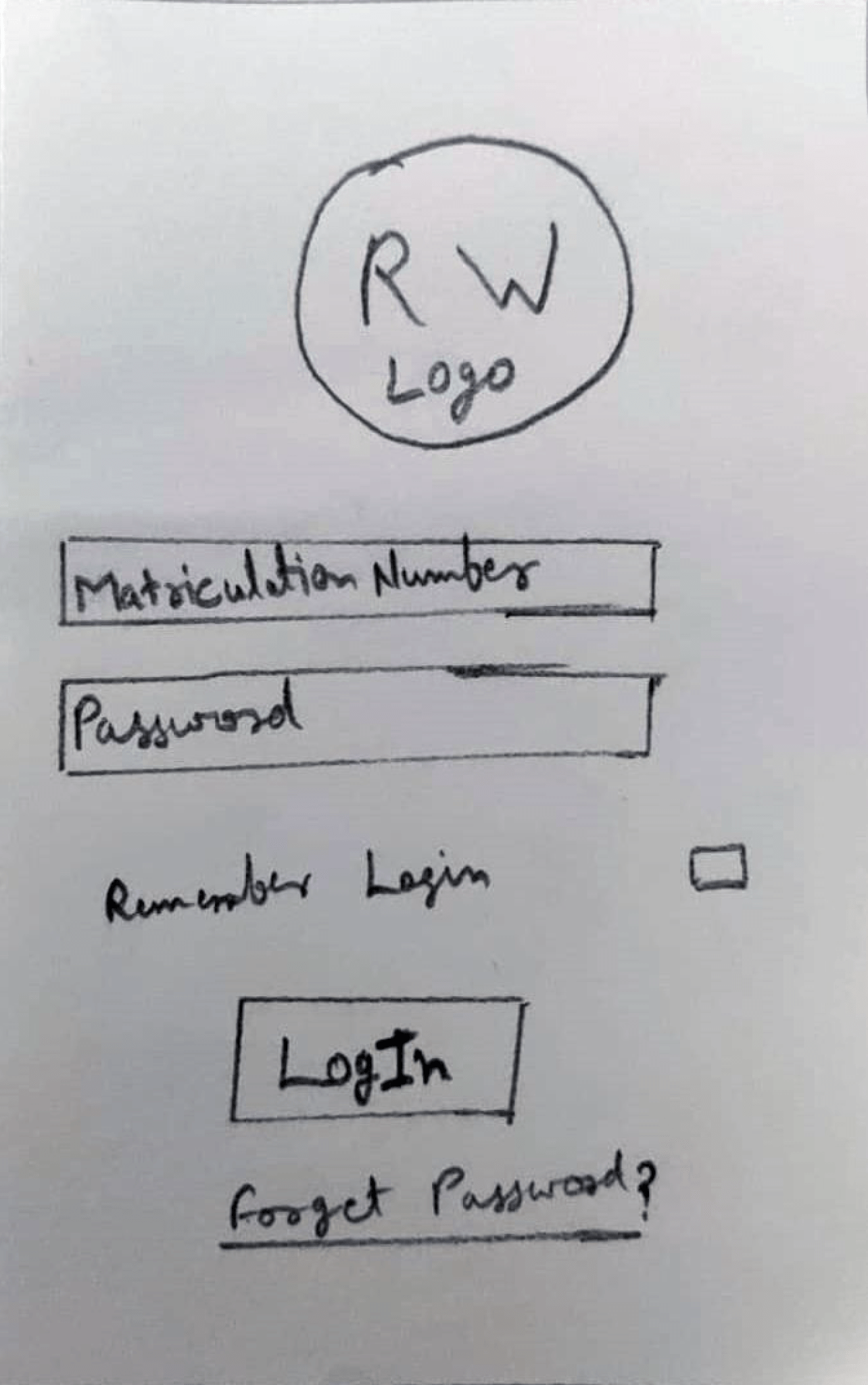
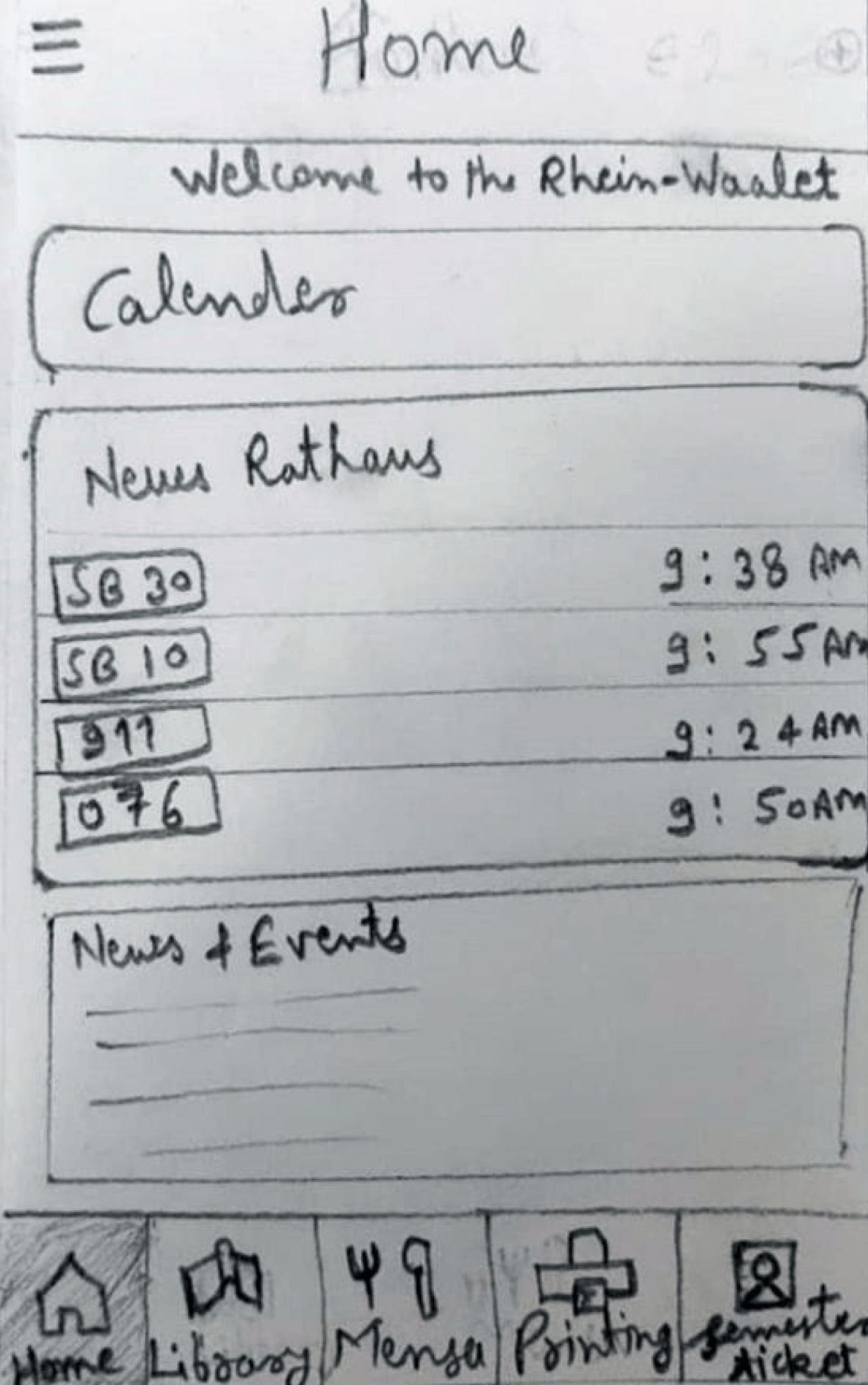
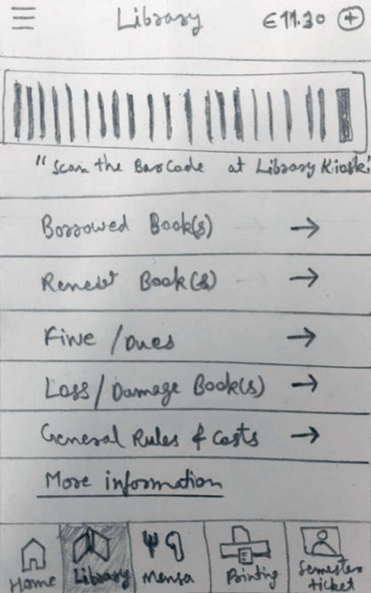
A rough paper sketch was created to outline the app's functionality and test user workflows before transitioning to high-fidelity designs.
Usability Testing (Round 1)
Moderated think-aloud sessions were conducted with the same group of students in a usability lab.
Key findings incuded:
-
Tabs for each university card were well-received.
-
QR-code payment was appreciated.
-
The homepage had too much information and was confusing.
-
Library functions were unclear.
-
Direct checkout should be visible only after food selection.
High-Fidelity Prototype (Iteration 1)
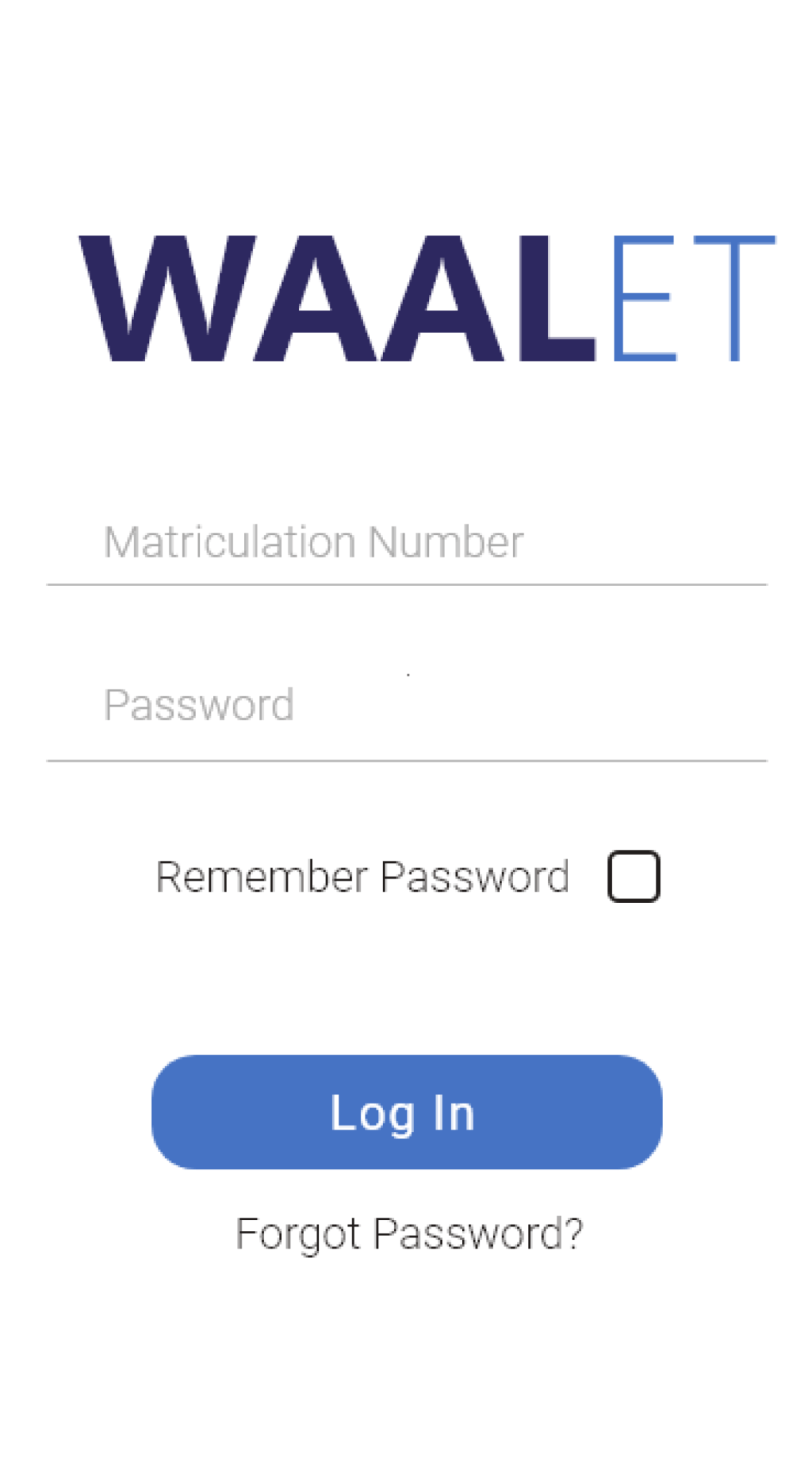
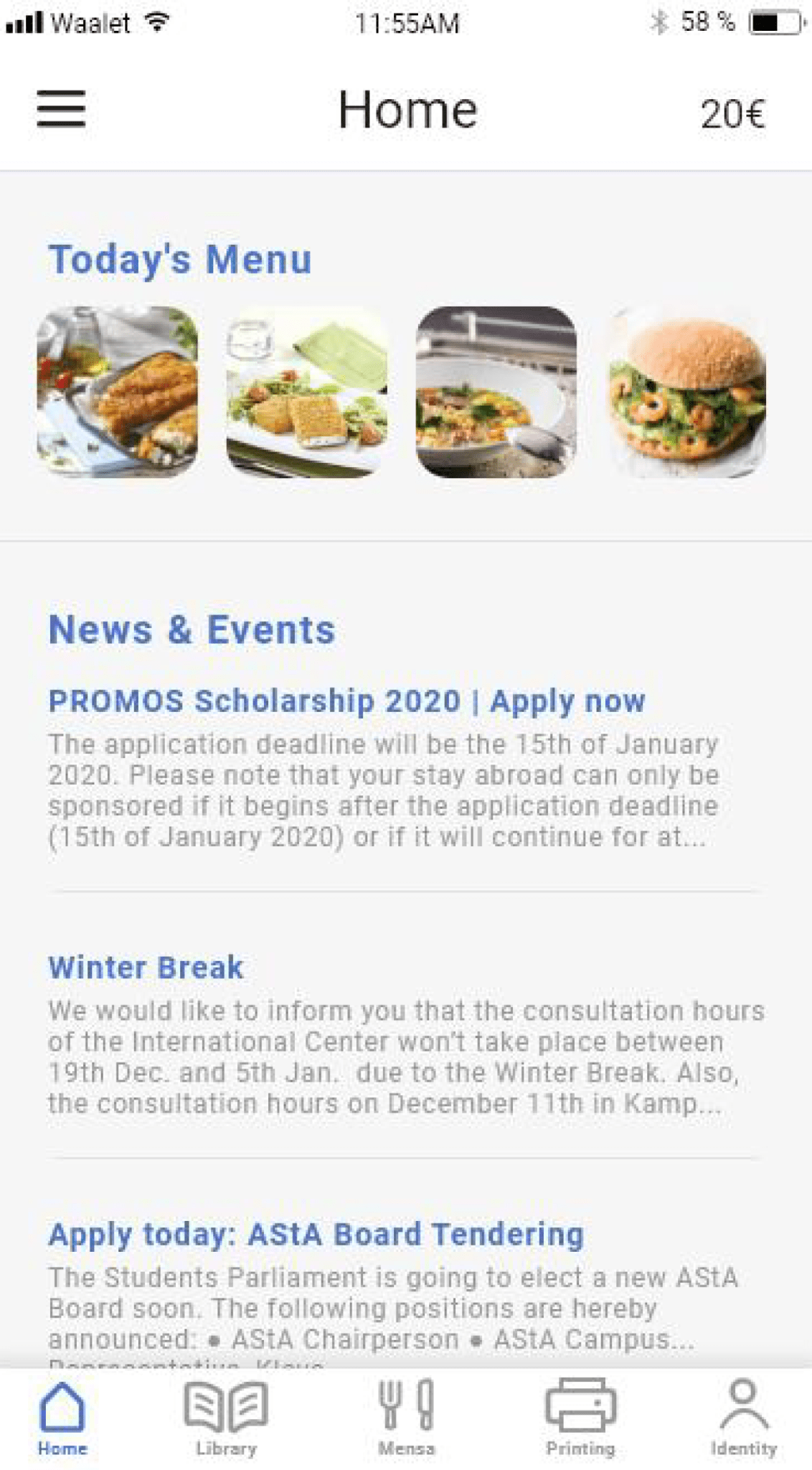
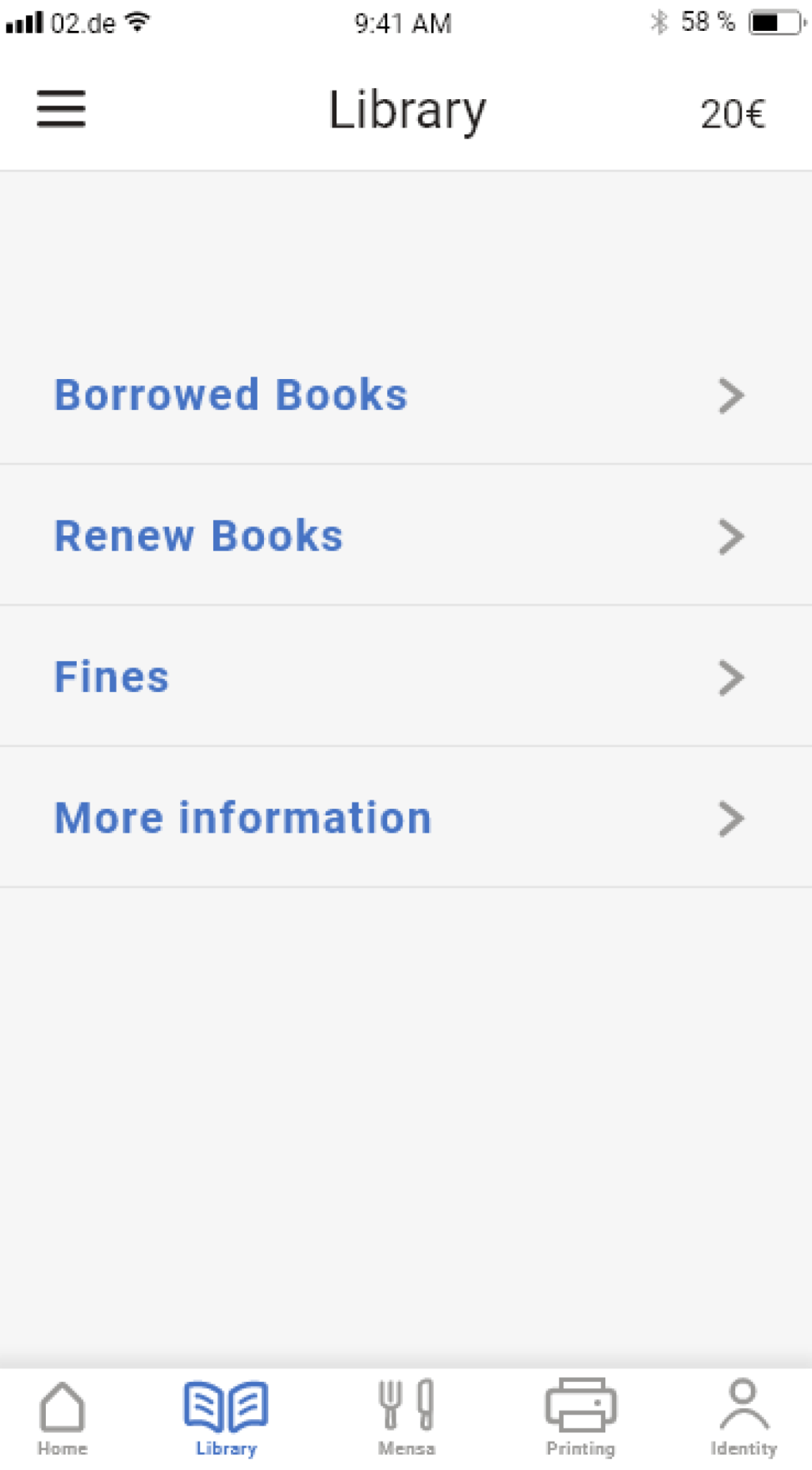
A polished version was developed in Adobe XD, incorporating feedback from Round 1. Changes included refined screens, enhanced colors, and improved visual assets.
Usability Testing (Round 2)
Unmoderated usability tests were conducted with the same participants. Five tasks, a questionnaire, and interviews were included.
Key findings:
-
Button size and placement needed revision.
-
Homepage required clearer feature organization.
-
Semester Ticket was hard to locate.
Information Architecture
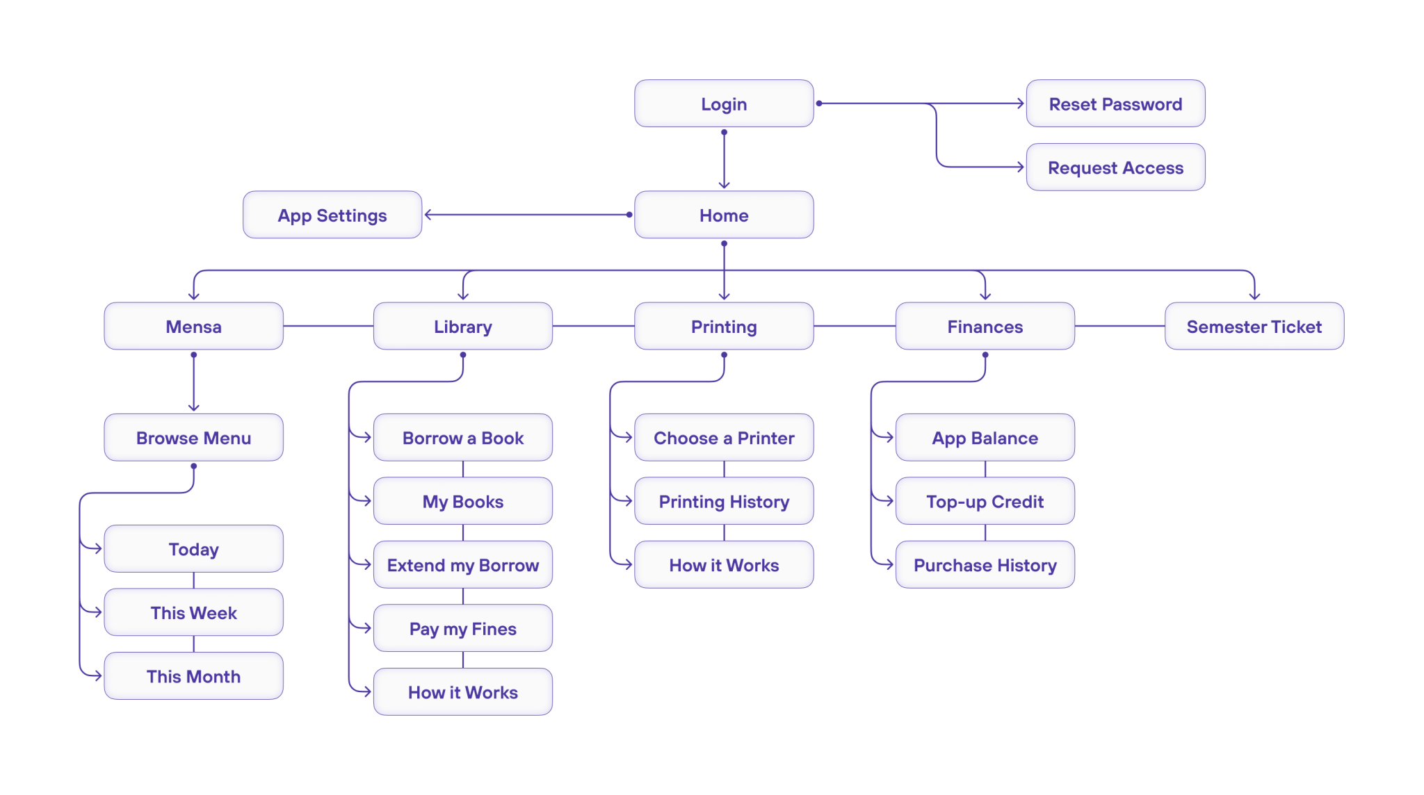
All pages and navigation structure were then finalized.
High-Fidelity Prototype (Iteration 2)
At this stage, further visual and usability improvements were incorporated, finalizing the app's design. Despite conflicting feedback suggesting features beyond the application's scope, the user flow was deemed intuitive with no major issues.
